Experiments:
I wanted to take a more rough but stylistic approach to these drawings, to get a feel of the new brushes I got on procreate. I also wanted to experiment with a mixture of textures to blend with the brushes.
The first experimental piece was inspired by Spiderman: Across the Spiderverse, which is where the inspiration for the rough comic book style came from. The second experimental piece was more of a personal approach, taking something from real life and expressing a feeling through the use of my brushes and textures. The final experimental piece I used an anime protagonist and aimed to create a piece to reflect a representing word through harshness of the brush strokes and textures. The style feels mostly like punk and somewhat aggressive, all the while retaining some elements of the comic book style. However, these are only experiments so I will try to be consistent with a theme for this style to be applied to.
Monster Hunter Character Profiles
After deciding how I wanted to apply the rough comic book style, I decided to create character profile sheets for characters in the Monster Hunter game franchise. I wanted each of them to feel unique and display their character traits.
I used movie posters that used a torn paper texture as inspiration for the background and character placement, whilst retaining the halftone and hatching brushes to keep the comic style textures. While these are not final outcomes, I want to try and apply these further into something that would be more interesting and descriptive for these characters. The character images serve as placeholders for when I draw the characters myself in my actual style.
Monster Hunter Trading Cards:
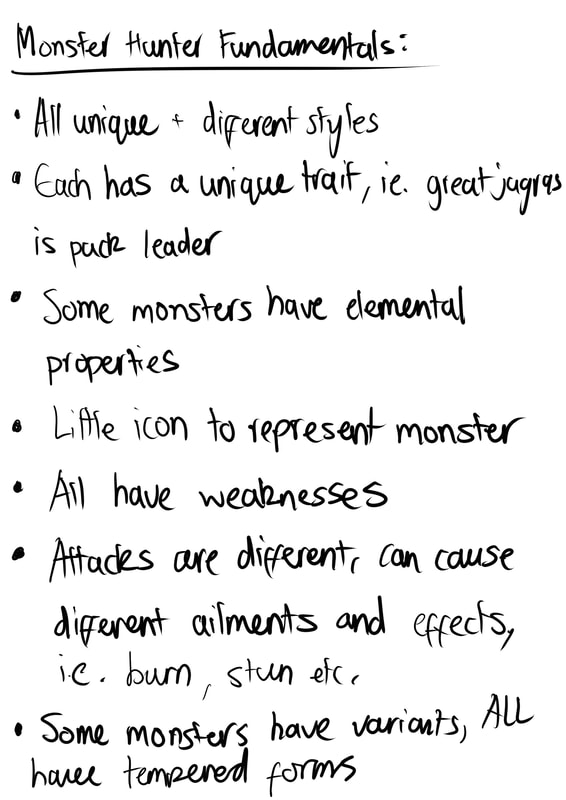
Personally I felt the best way to properly present monster characters in a more interesting format would be the trading card format. I looked at already well established trading card games to identify and understand the format and presentation of a card, as well as the back of a card as well. I noted down basic fundamentals of the Monster Hunter monster characters, which could help when depicting a card for said monsters.
Probably the easiest thing to do first would be the back of the card. I designed different mockups for the backs of cards to get a sense of what the best depiction of the cards could be.
The first two concepts felt like they were both from different sets of tradings cards, like the latter is an expansion format, i.e. booster pack, of the trading cards, while the last one feels more like a neutral, default style. The Monster Hunter World card backs are probably better to use as they both feel like they come from a different set. I will design monster cards for the monster characters next.
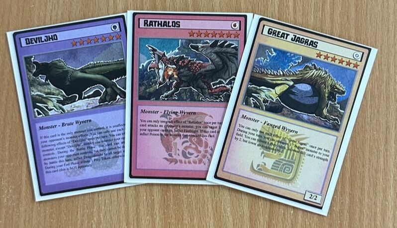
Using what information I could gather on the characters from the game, I made some monster card designs for each unique monster. While the images consist of the placeholder pieces shown above, these will need to be edited. The card designs are not final yet but the design concepts here will pretty much be what to expect from the final outcomes. I will choose three of these designs and finalise them with my own style of the monster.
After deciding which three monsters I would like to finalise into prints and cards I sketched them all out, still keeping the backgrounds for each of them near enough the same.
These are the final images I will be using for prints. Overall I feel they are much better and more personal than my original designs.
Once the card designs and the new illustrations were finished I compiled them all together and printed them on good quality paper.
Overall the result was very nice, they were better than I was expecting.

