In this section I will post all my planning and developments of anything I plan to use in my project.
Script:
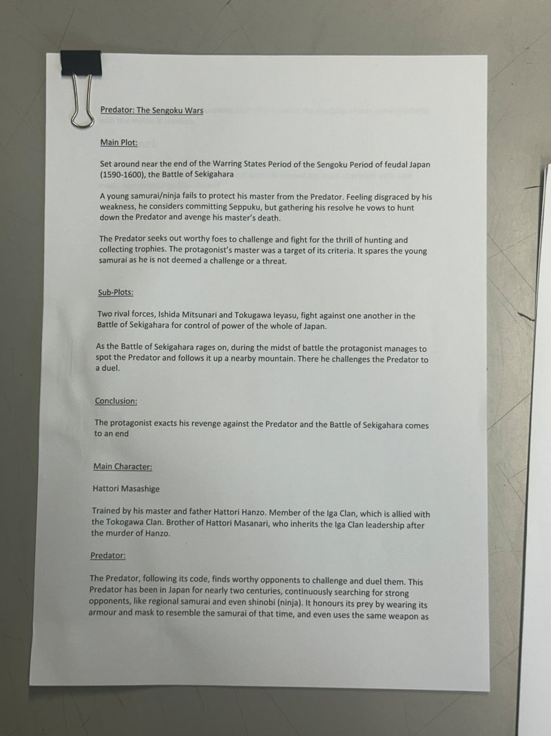
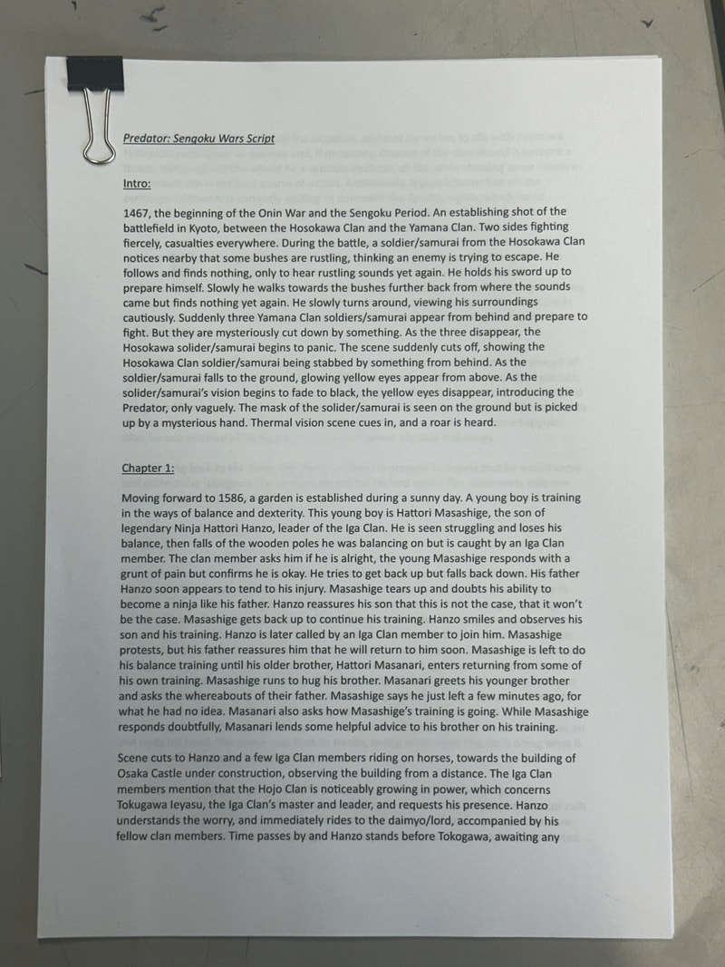
First and foremost, before designing and drawing anything I had to come up with a script to be able to draw up scenes easier.
Front Cover:
For my front cover I wanted to change the idea behind the Predator and how the comics usually go about presenting it. While the Predator comics go about showing the Predator on its front cover, the Predator is a creature that cloaks and hides in the environment, hunting its targets one by one. What I want is to add a sense of mystery, not showing the Predator fully, leaving very little detail to be seen and left for the viewer to interpret what it will look like.

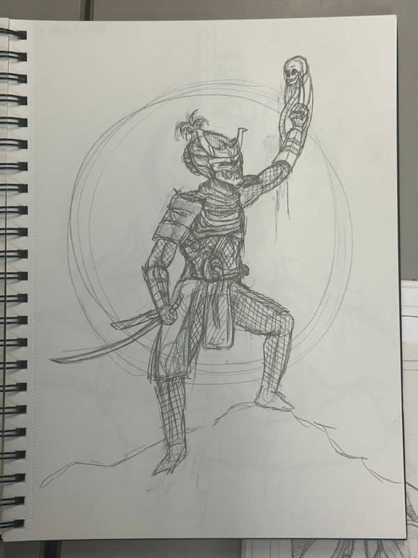
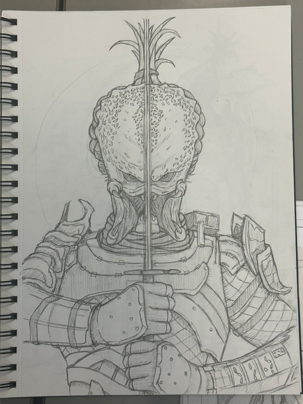
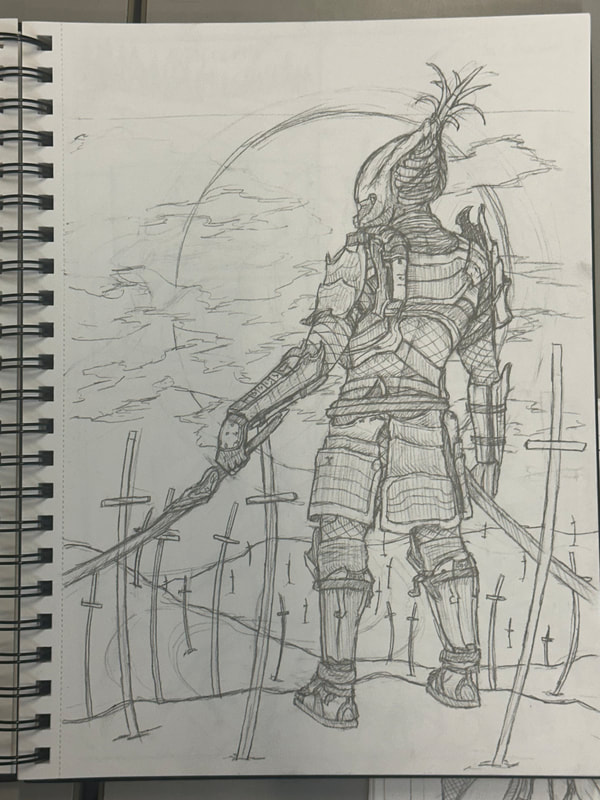
While I had a general rough idea of how to present the Predator on the front cover, it was actually making it look mysterious and threatening that was the issue. I had included details in the last three drawings, which would ultimately be wiped out by the darkness I intended to shroud it in. While the second to last drawing was the one I originally wanted to go for, it still showed too much of the Predator so I opted to go for the last drawing as that had more of a chance to be kept mysterious but threatening at the same time.

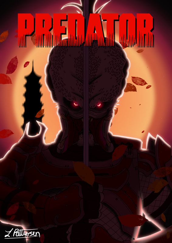
This is the base drawing in which I would scan and take it to Procreate to digitally add and edit bits and pieces into the drawing.
The base colours were the first priority, and so to make the Predator stand out whilst keeping the element of mystery I had it stand in front of the massive sun. To add a sense of danger, I had the Predator stand in the middle of a field of swords showing a glowing, crimson eye. It accomplishes something that the Marvel Predator comics fail to do: keep the Predator's appearance a mystery.
Pages:
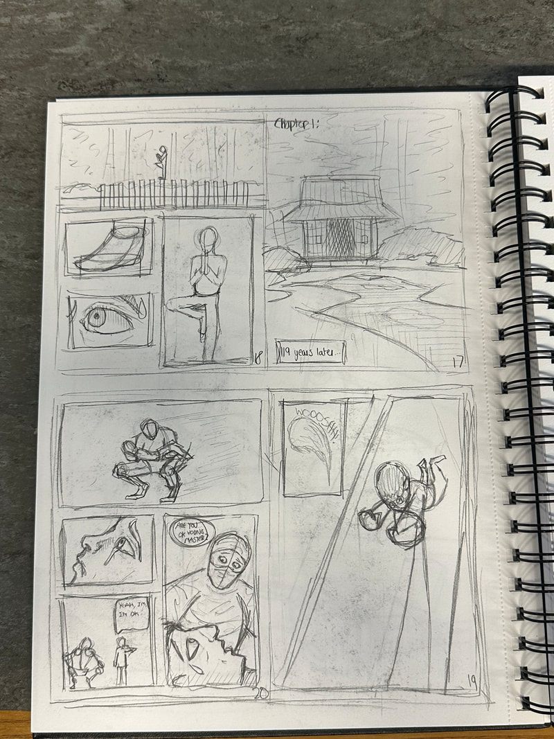
These are the first few pages for the introduction of my manga. They are roughly drawn to get a rough idea of how I want the pages spread out, how the panels are laid out and how the scenes and characters are depicted. My aim is to have all the pages depicted in black and white, inspired by both manga and Kurosawa's black and white media.
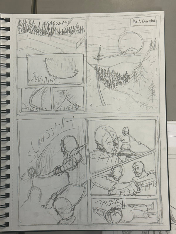
Page 1:
This page serves as the start of the prologue of the manga, introducing a war in the time period of feudal Japan. Quite like how my front cover depicts the Predator standing in a field of swords, symbolising the victims of the creature, I want the page to show a similar feeling.
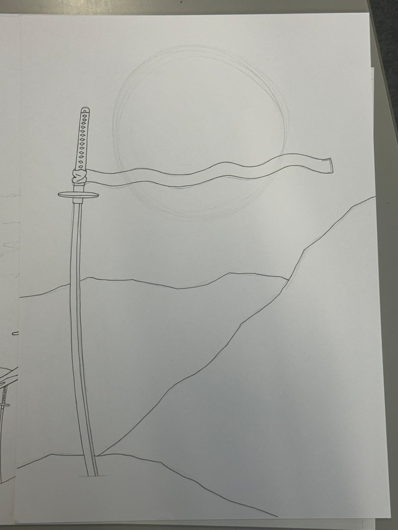
The page is kept in black and white as manga is always done in black or white. The base image felt really bare and hand drawing all the details would take too long and become tedious, so it was made much quicker and easier using the different brushes to do the fields of grass and the trees. While halftone would be the main use in manga, I decided to keep it simple and use the airbrush tool to control the contrast and tone.
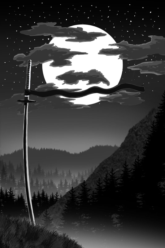
While the image includes depth in the background, the trees closest to the foreground blend in too much with the mountain they are drawn on. The moon is also present in this page so highlights will need to be included on the trees. While this may be tedious the outcome I hope will look much better.
Refinement:
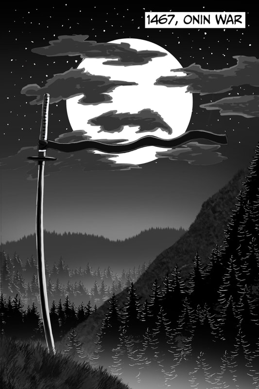
As I hoped the highlights help push this image further with improvement. Since this page also acts as the introduction, I also included text of the year and event of the time period the scene is set in.
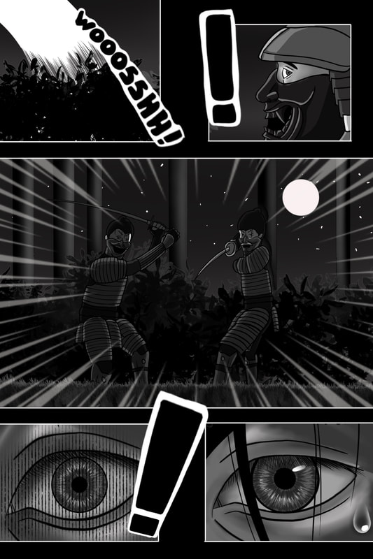
Page 2:
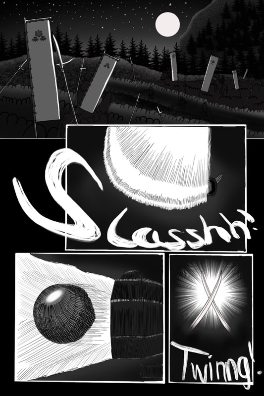
This page's purpose is to establish a fight is happening between two conflicting sides. The panels I have decided to be more impactful, leaving the opportunity to use onomatopoeia to blend with the action of the swords slashing, colliding and a gun firing.
I have kept the page black to give the sense that it is nighttime. The use of the moon helps add to this sense as it is the only light source in the scenes and gives the viewer the opportunity to look closer to see what is happening. While the onomatopoeia is very rough I will go back into it once I make it more of a priority. The hatching around the bullet panel is also rough and not that great, but it can be something to work back on as I make more pages.
Refinement:
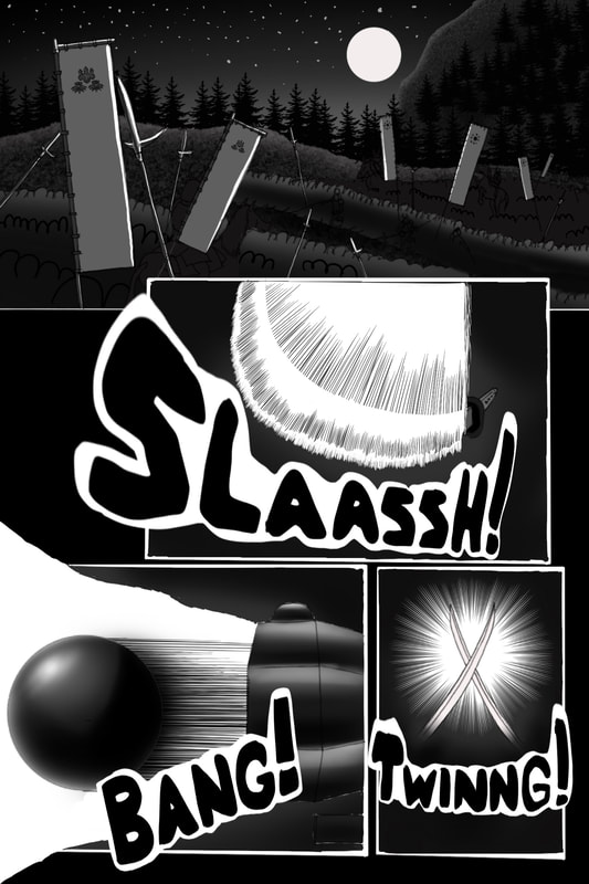
I decided to abandon the hatching style for the bullet and gun tip as I thought using the airbrush tool would give them both a metallic feel and would make the process both quicker and cleaner. The onomatopoeia I also had cleaned up and polished. While I believe the words could be improved ever so slightly I feel I need to prioritise the rest of the pages rather than focus on just sound effects.
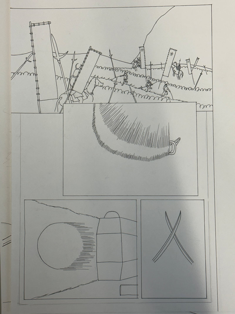
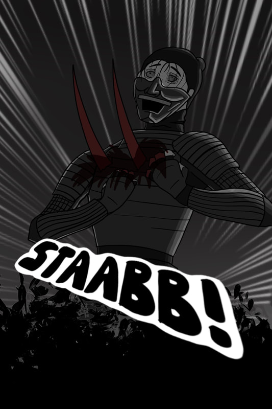
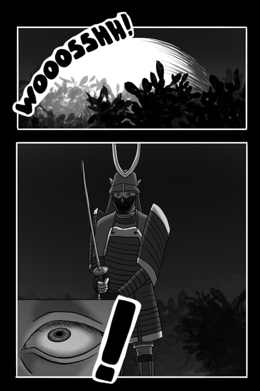
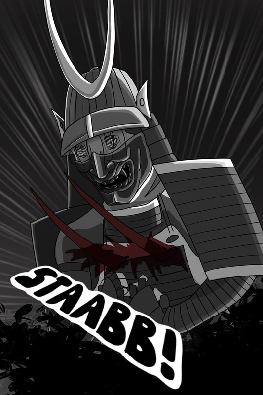
Page 3:
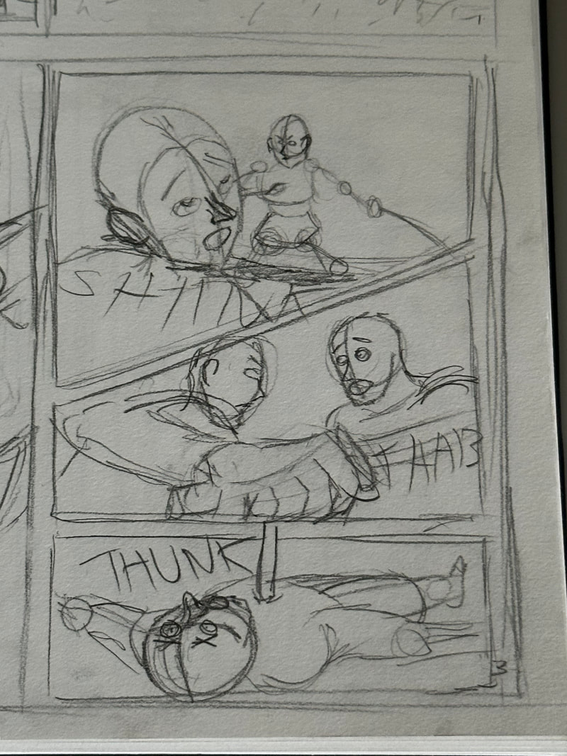
While the rough sketch is ambitious and a seemingly interesting idea, producing it would be a completely different issue in itself. So I will pick apart each panel and draw each one separately to get the form of each character right.
With each sketch for each panel set I will take them all to procreate and add all the details I need.
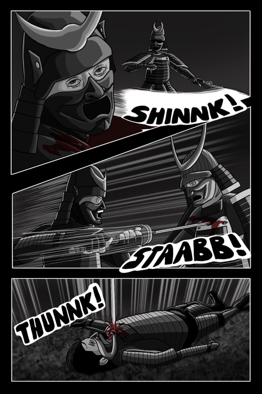
The page turned out better than I expected. I didn't include the mouth of each character as I thought the mask that each one was wearing was expressing the emotion I intended for them. I did my best to make believable action lines to show the movement and swiftness of the character. The onomatopoeia I kept in the fashion of following the action, though for the last panel it would've looked a bit awkward which is why I left that sound effect alone.
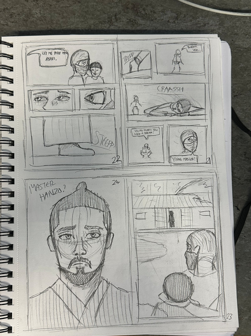
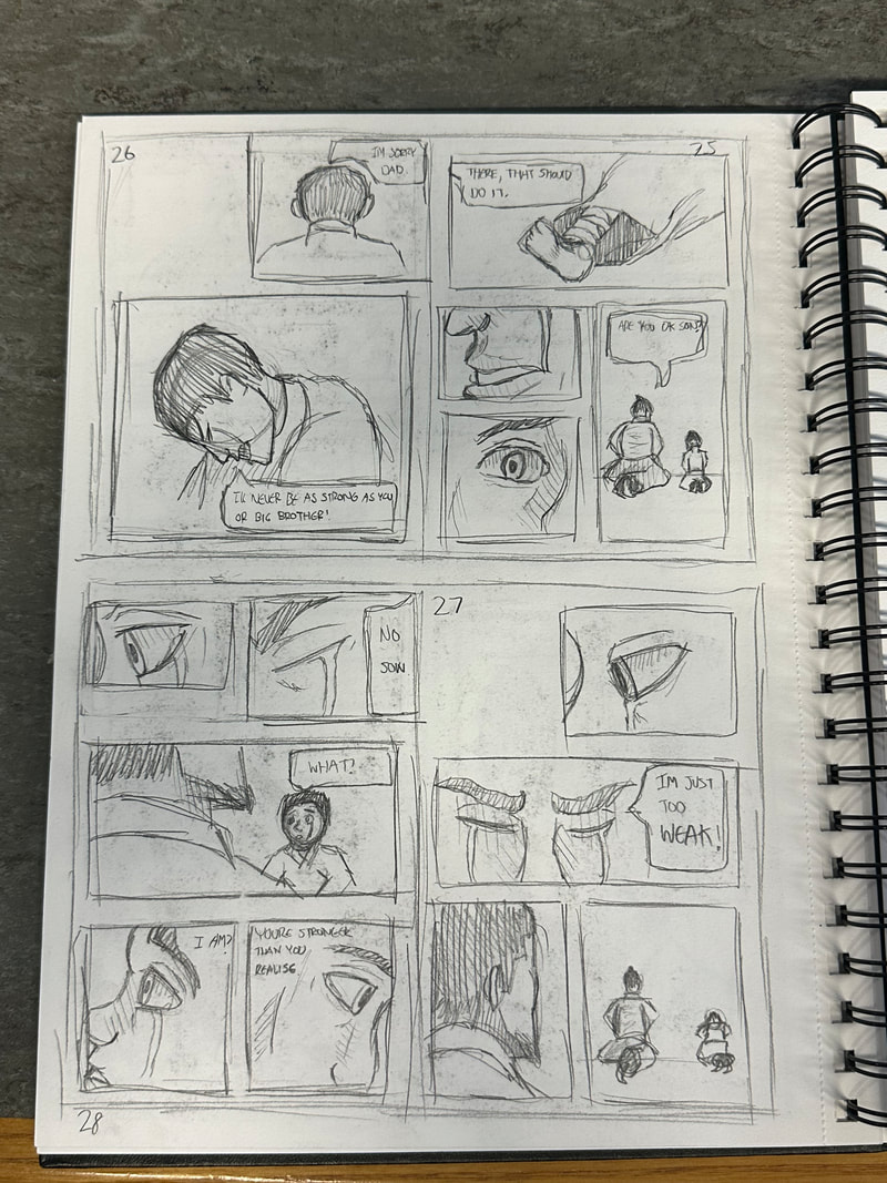
Page 4:
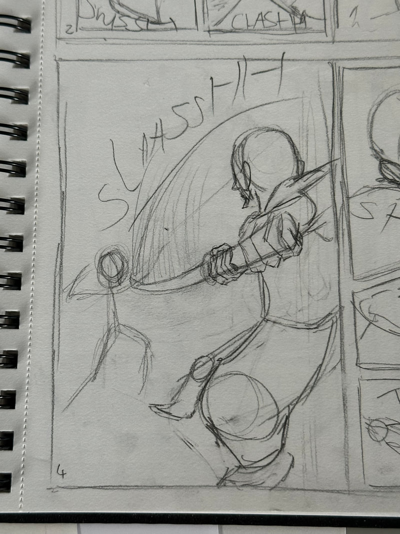
Similar to the previous page the rough sketch was ambitious but would be hard to produce. So just like the last one I decided to draw each character separately and add them together digitally.
With the sketches done I can move onto the designing of the page.
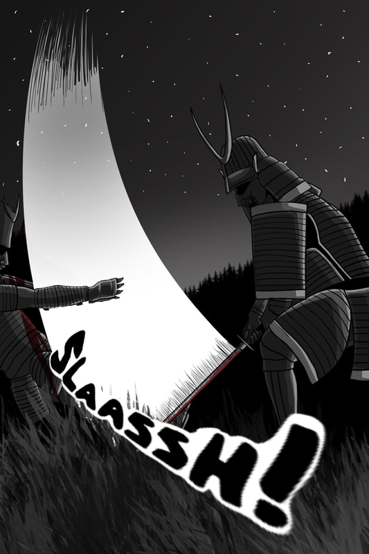
While the original idea was to show more perspective, producing it was very difficult for me as there were no good references for me to use to make the process easier. Despite this I kept the same elements for producing an action scene to keep some level of consistency.
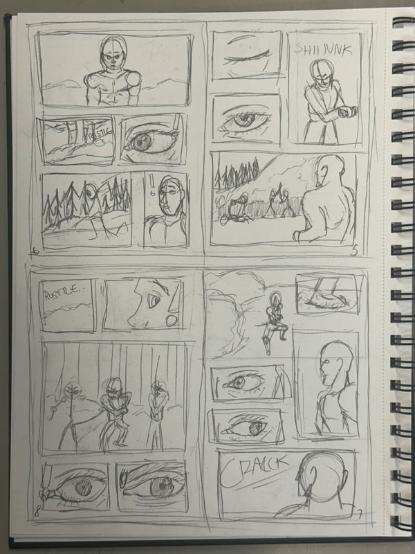
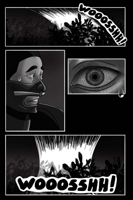
Page 5:

A pretty straightforward page. The main thing is to do the foliage in the background digitally as it would look much better than if I did it on the paper first.
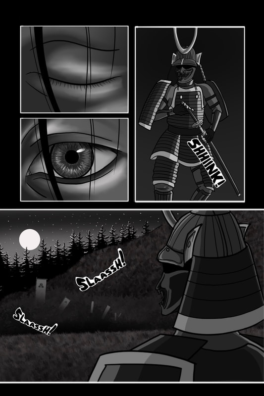
In the background of the last panel it was quite difficult to draw a crowd so I decided to reuse some of the clan banners from a previous page and blend them into the bushes in the background. I kept the highlights on the trees to make them stand out.
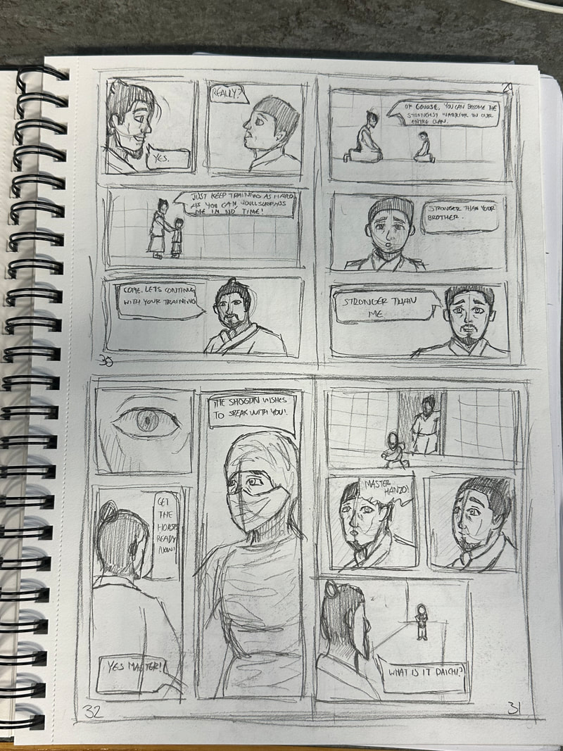
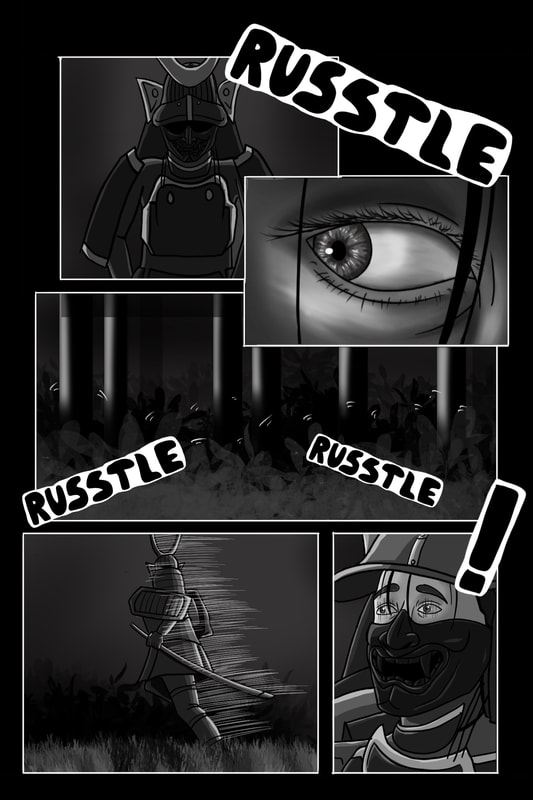
Page 6:

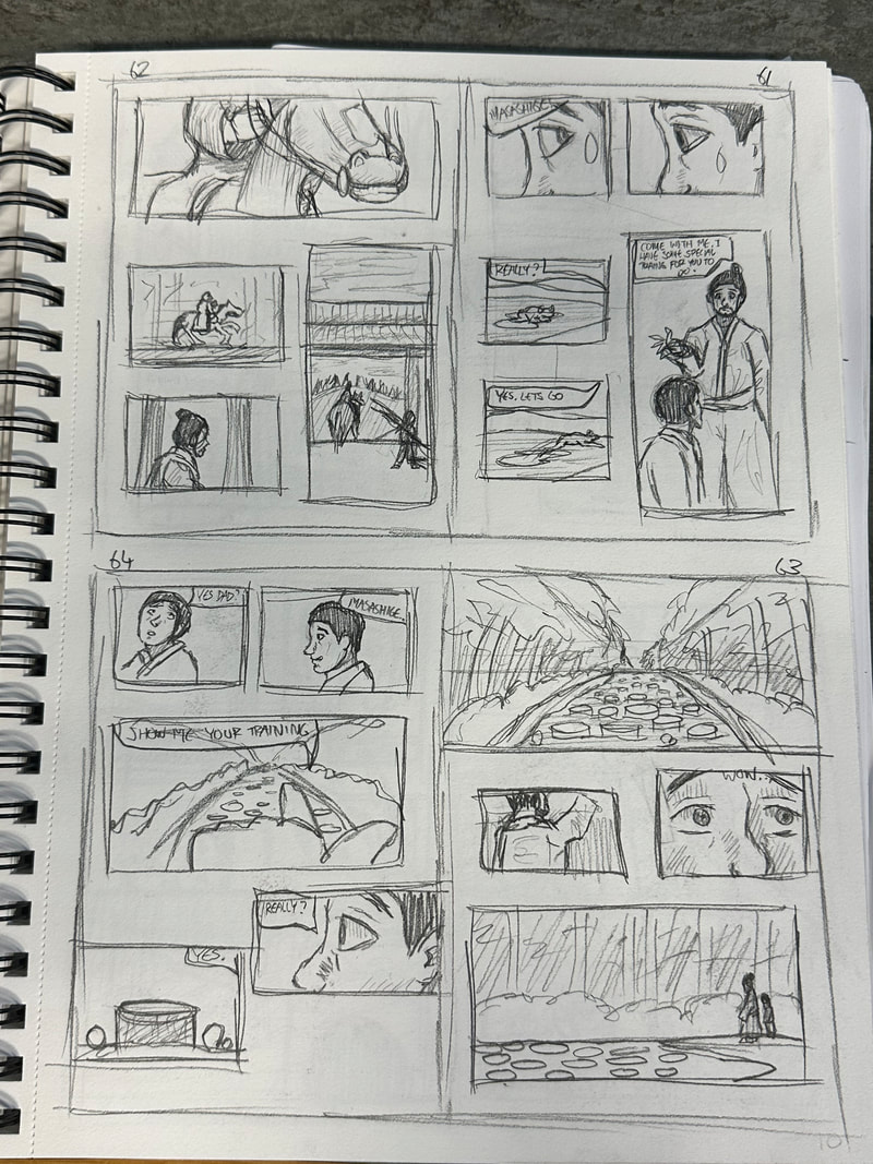
This page I wanted to imply that something is going to happen, so I decided to incorporate tightly packed panels with one overlapping two others to invoke that sense of importance. There wasn't many good poses of a back view of someone running so using a rough model I drafted up a pose to use.
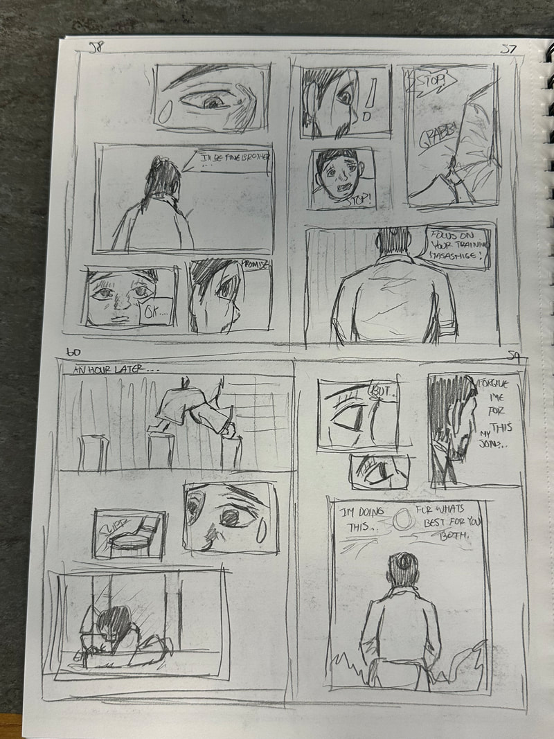
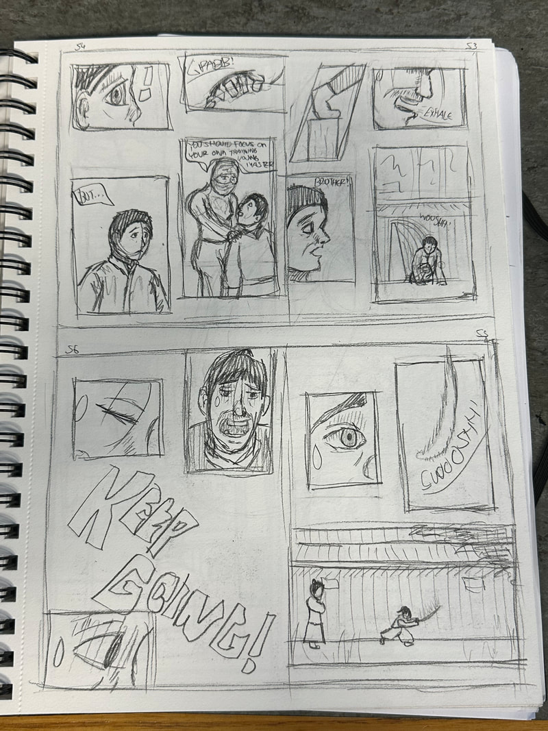
Page 7:

Page 8:

Page 9:

Page 10:

Page 11:

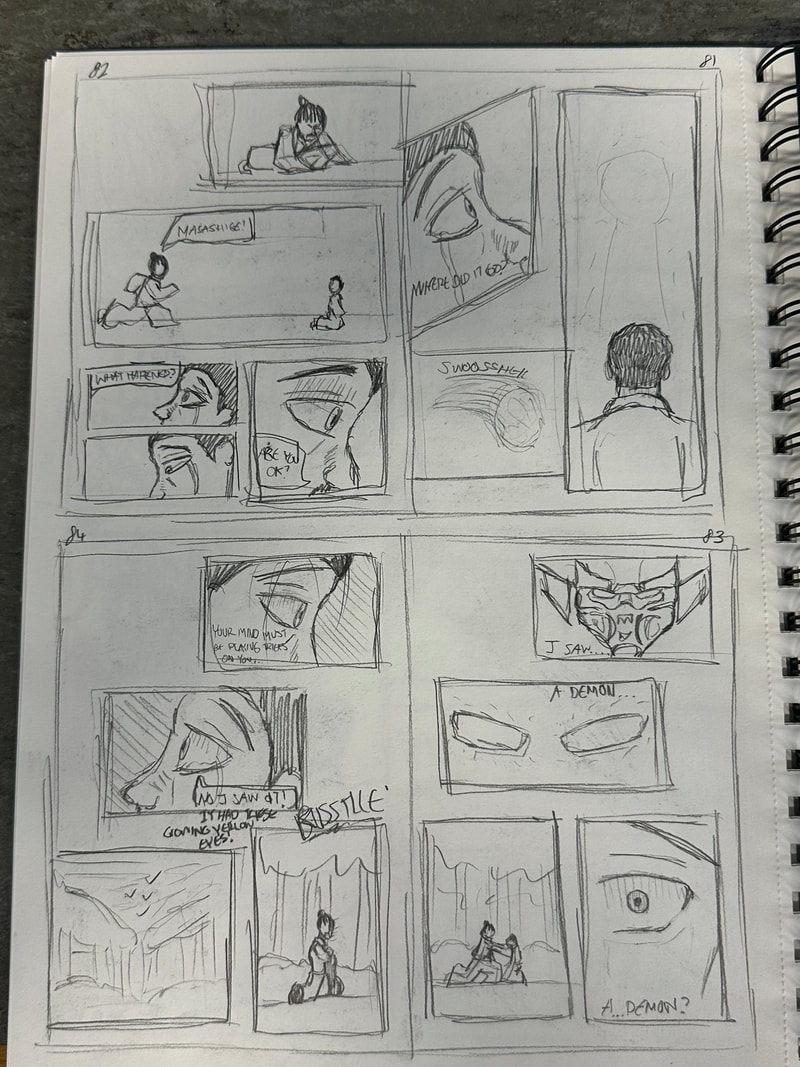
Page 12:

Page 13:

Page 14:

Page 15:
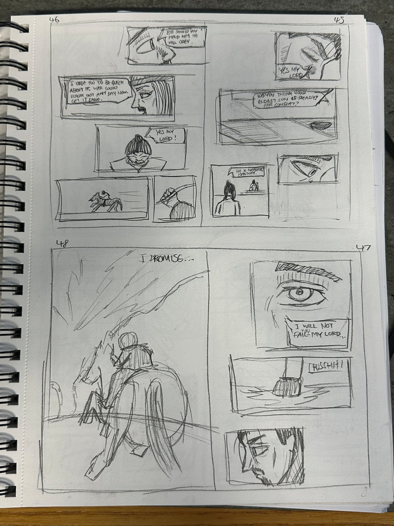
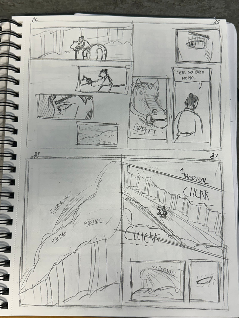
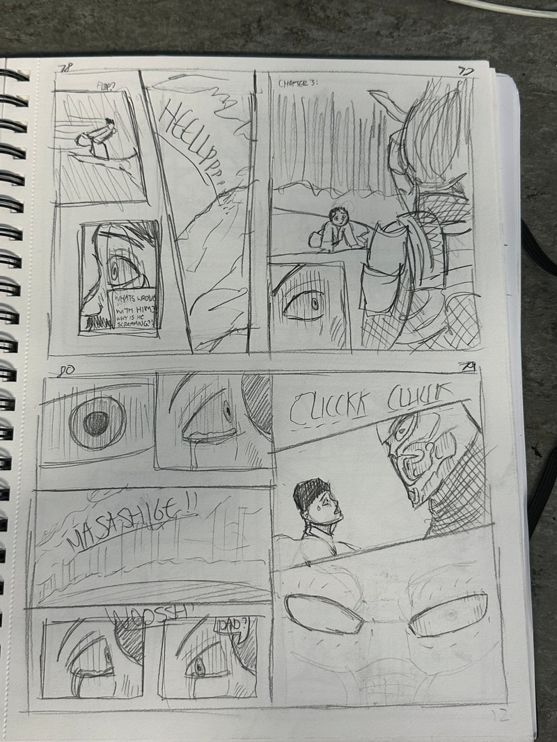
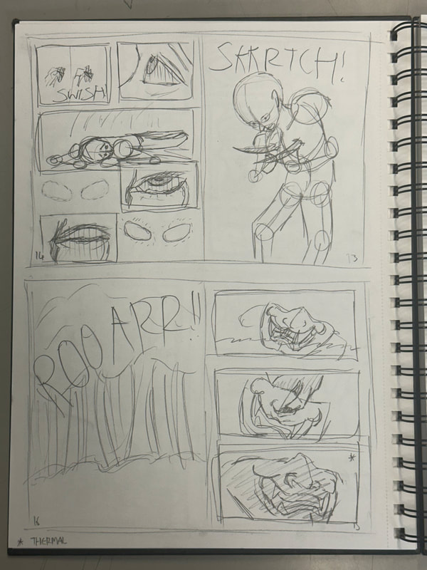
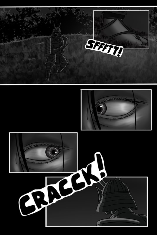
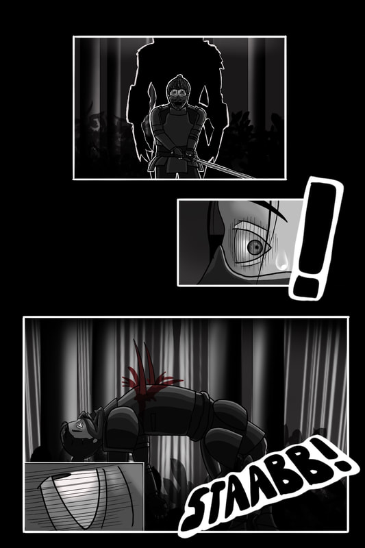
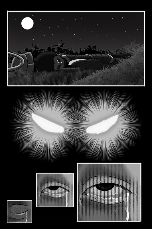
This page is meant to introduce the Predator, however it won't provide its appearance through detail, only through its silhouette and first person view of the character. It also serves as a eventual change of appearance for the Predator, as I intend to have it wear regular style clothing like the Predators in the older movies, but later it will make its own samurai armour after being inspired by the vast majority of samurai its killed and the mask it finds.
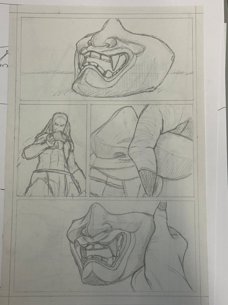
Making a dark mask in a dark background is quite a difficult thing to do so i could make the mask lighter should I feel like changing it. The last scene depicts its first person view in thermal vision, which feels quite difficult to accomplish in manga, but I can return to it once I feel it should be made a priority.
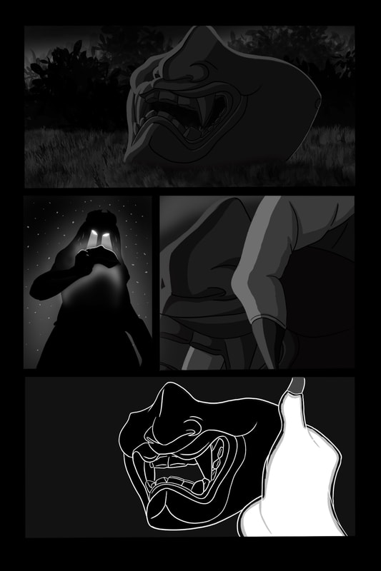
Refinement:
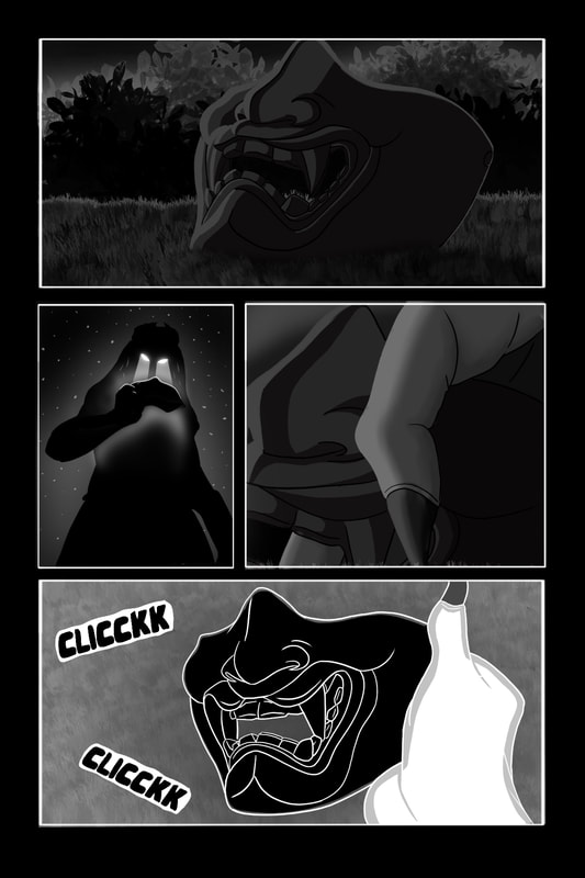
The issue with the previous version of this page was that the pages and the panels were too close to blending in with one another, so a simple fix to this was to add a white border over each panel to help the panels stand out more. I also decided to blend the skin on the Predator's hand, as I did with all of my human characters, to give a fleshy texture whereas with the armour and masks I kept the same. The final panel I left alone as that depicted the Predator's thermal vision, with an inverted grassy texture and some sounds effects to help make the panel pop more.
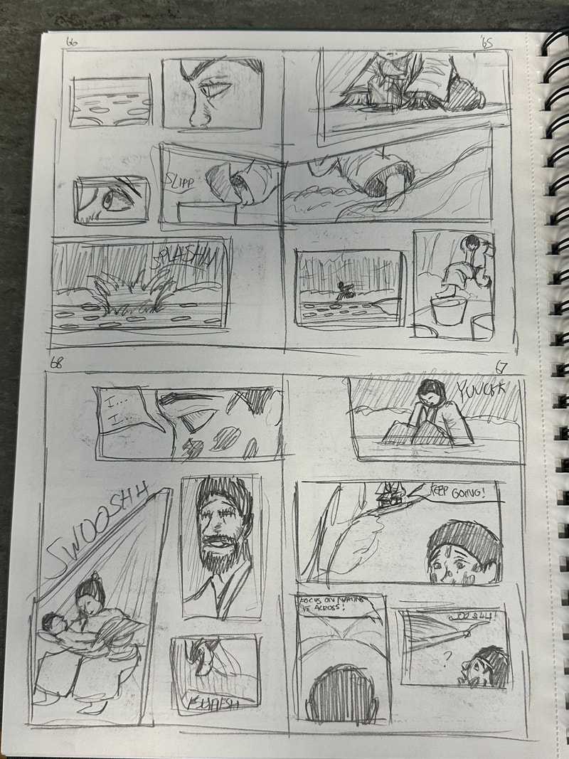
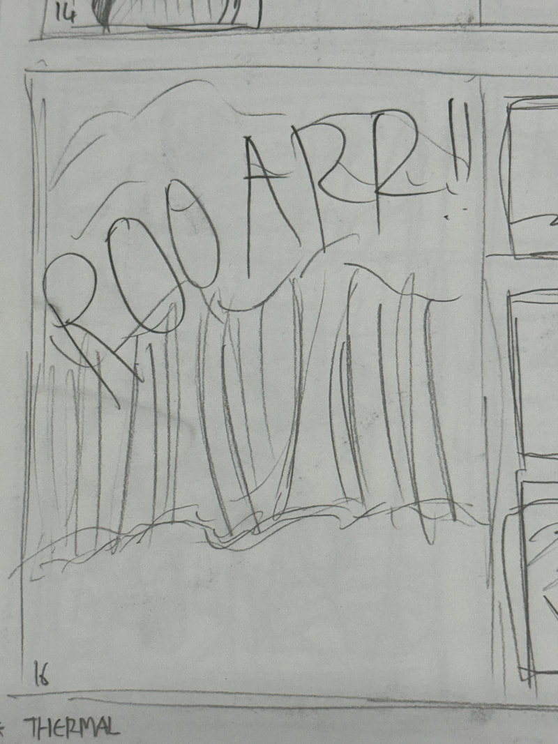
Page 16:
Updated Project Outcome:
Page Drafts
Unfortunately I realised that within the time frame I would not be able to finish the entire thing, however, I will provide unfinished page designs to a point where it's up to an appropriate standard to show my process. I will also provide finished pages, like the ones posted above, and present those in a way in which it acts as a preview, as what to expect from the rest of the manga if the final product was made.